

A Consistent Brand Image
Silgan Plastic Food Containers is just one of three product line websites we were going to be redesigning. It was important to maintain a consistent and cohesive branding strategy across all of Silgan’s sites.
Using their holdings site as a reference, we created a unified color palette and chose typography and imagery that aligned with the packaging company’s overall brand identity.

Navigation and Structure
Our approach to site structure was centered around creating a clear and intuitive navigation system. We began by conducting a thorough analysis of the existing site, identifying areas where users frequently experienced difficulties in finding information.
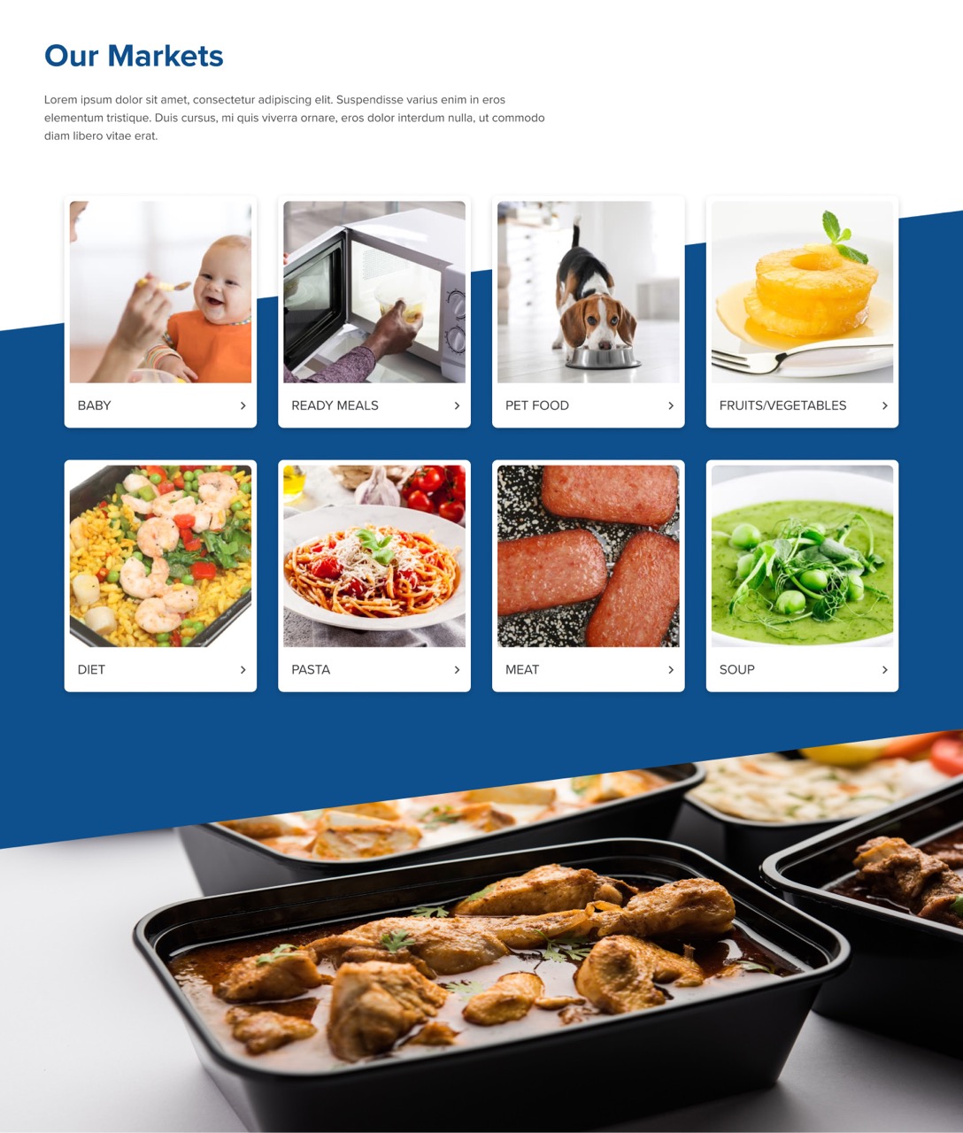
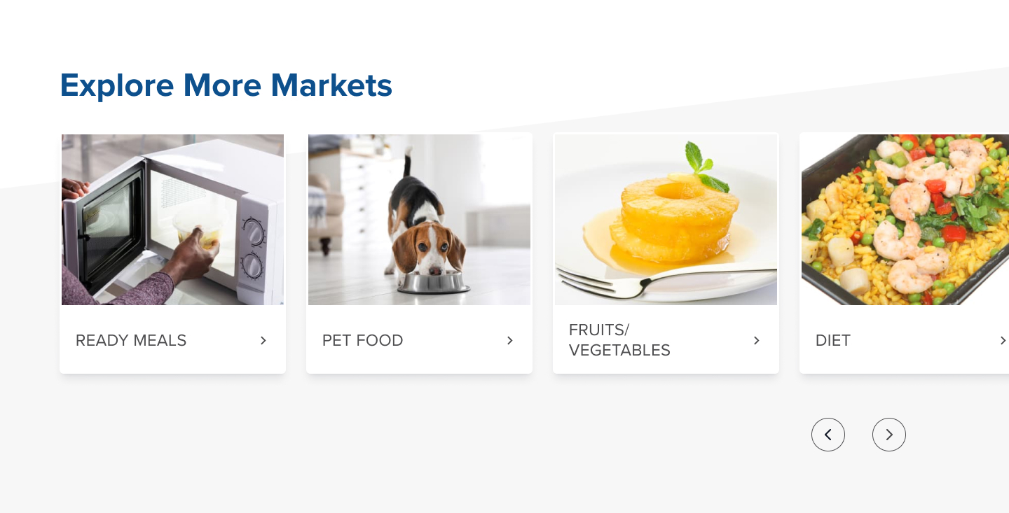
We took this most sought-after information, such as product details, company information, and contact pages and made it more prominent in the main nav. We also introduced breadcrumb navigation to help users track their journey through the site and easily return to previous sections.
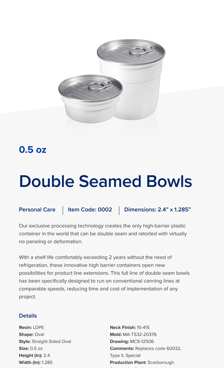
For the page structures, we adopted a more consistent and organized layout across the site. Each page was designed with a clear purpose and structured to present information in an easily digestible format. We used headings, subheadings, and bullet points to break down text, making it scannable for users.
The content itself also underwent a revamp. We focused on making it more concise and relevant, removing outdated information and jargon that could confuse or deter potential clients.

Contact Matchbox Design Group Today!
If your website could use a refresh, if you’re looking to drive more traffic to your site, or you would like to submit a guest post, fill out the form below and we’ll contact you to learn more about your digital needs.